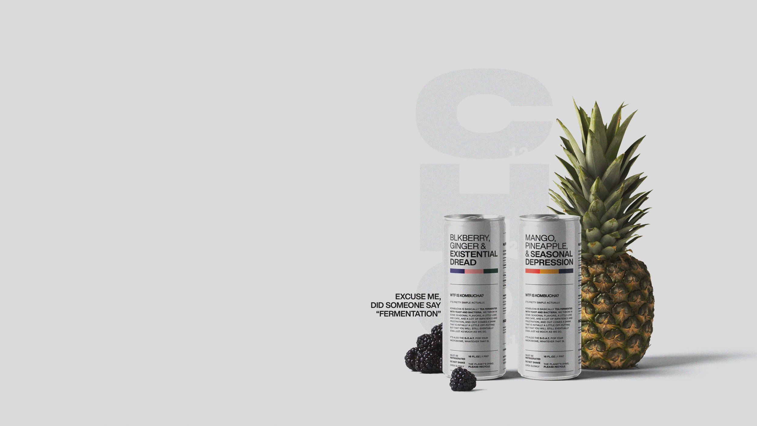
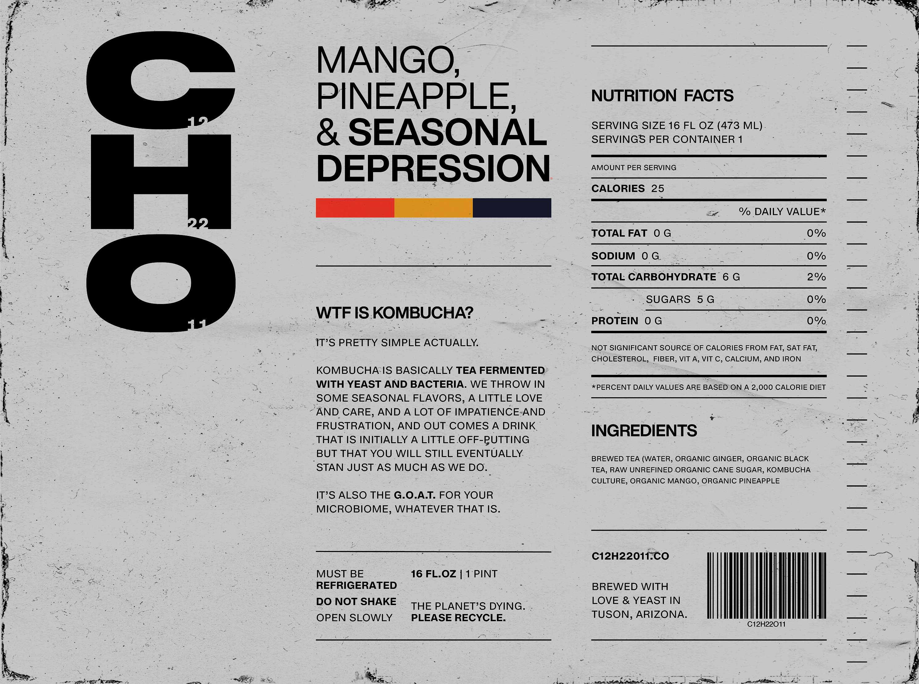
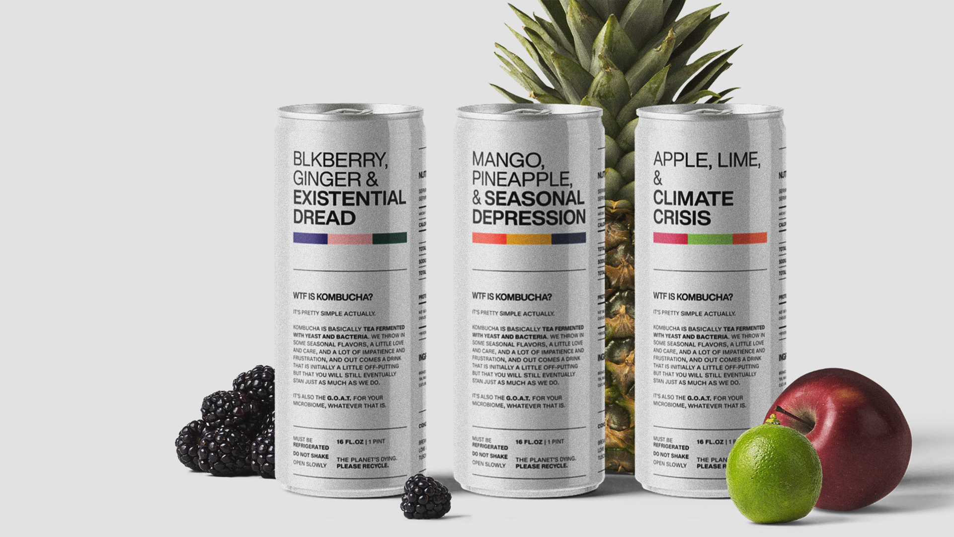
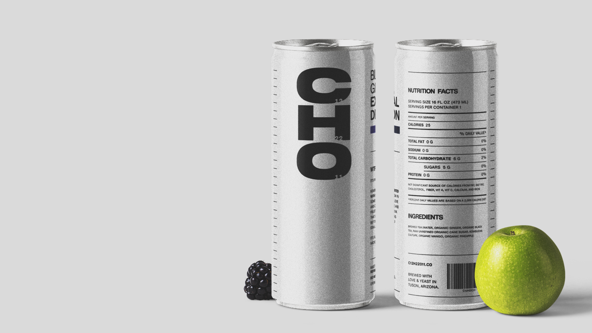
CHO

A New Market for Kombucha

Kombucha is so sick. It’s healthy, it’s delicious, and it’s pretty straight forward to make at home. And despite all that, and growing sales, it’s still a relatively fringe product. I think a lot of this has to do with the positioning of kombucha as a wellness drink, propagated by its largest brands. What if there was a kombucha brand that was more relatable to the typical consumer, less preachy about its benefits and more direct about it straight up tasting good and being healthy.

This is completely concept work. My friend Jaren actually brewed up a couple bottles for fun, but as of now there’s no plan to put CHO on the market.

But if you’re interested hmu?

Concept & Name

CHO is all about cutting the BS. Hold my subtlety, let’s try just being straight up with consumers for once. It's raw, a little jaded at times, and knows that at the end of the day, it’s literally just a drink. It's relatable in both its utility, and its futility. 

CHO (pronounced as C-H-O, not ‘cho’) is derived from the chemical formula for yeast - C12 H22 O11. Numbers are hard to remember, so I cut them, keeping a small reference to the full version in the logo. That's about as straight forward as it gets

Type

All of our type is set in Helvetica Now. I don’t think I need to preach the merits of Helvetica to you, but it fits the quasi-brutalist aesthetic we’re going for. All caps of course. Because being loud is being direct.

Package

The can was the most important part of this project. No distractions, I just put all the information out there in a clear hierarchy, maxing out the can’s real estate. Instead of a traditional label, the CHO can prints directly on the aluminum, using the material as a core part of its image, rather than an obstacle.

The title of each flavor is probably the most distinctive aspect of the label. Two bright flavors contrasted with the everyday nightmares of my generation. Simple, relatable, and high key funny. Wrap it up with a cute explanation of kombucha and we’ve got a can with a lot of utility and personality, and will stand out from anything else on display.

Web

The website is really just a longer form version of the can. We explain our brands positioning and rationale, show our product, and have an order form. Also, merch of course.