Curb

Bringing food trucks into 2019

There are countless food truck apps available for web and mobile. They all suck.

Starting in the Spring of my Junior year, I began ideating on how to improve the accessibility of food trucks for the typical hungry millenial. By the end of the semester I had formed a team around the project with developer Conley Ernst, marketing lead Michelle Bushoy, and UX Researcher Carolyn Zelicoff.

I managed all branding, visual design (including our UI), and creative direction.

Research

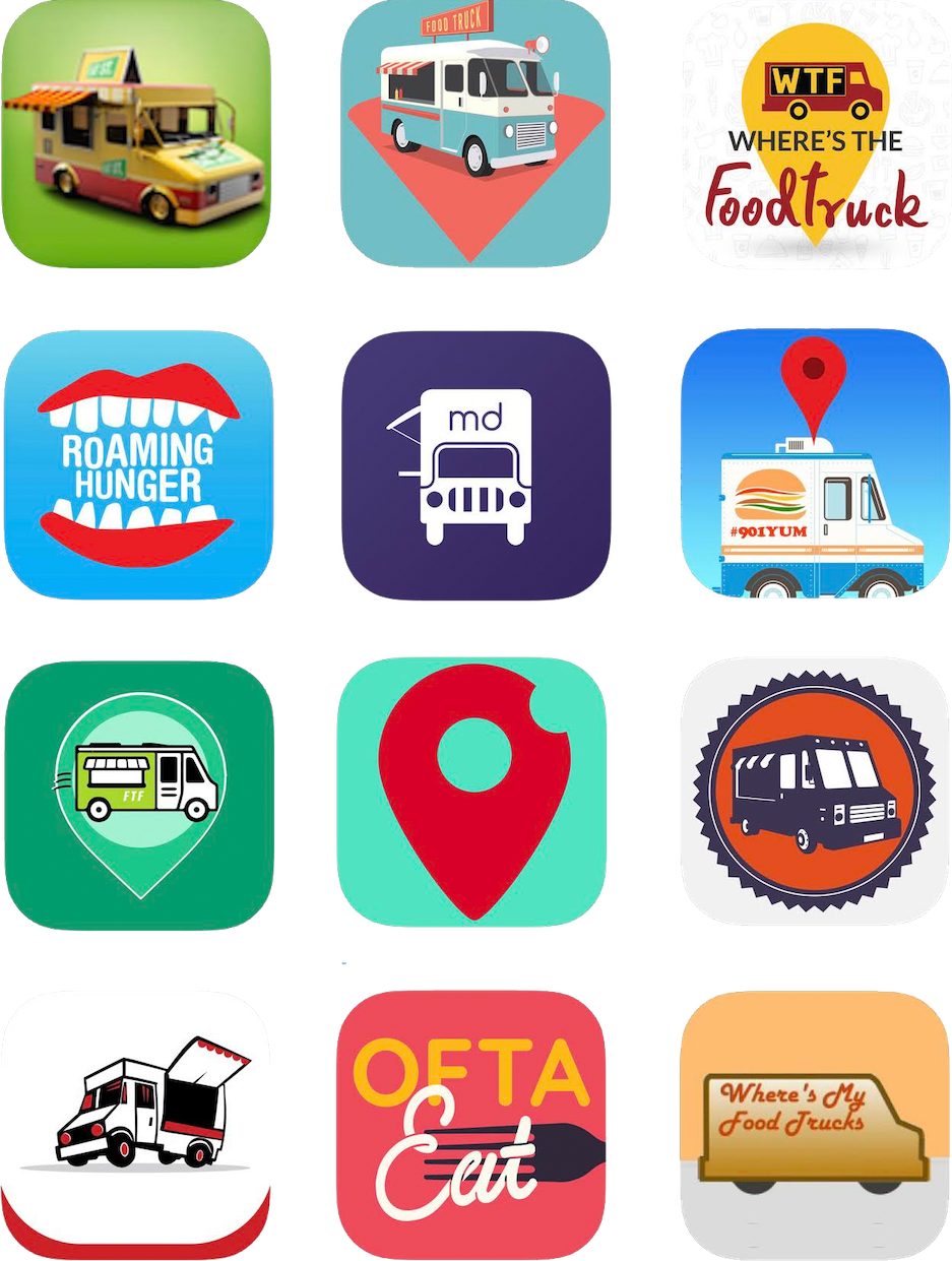
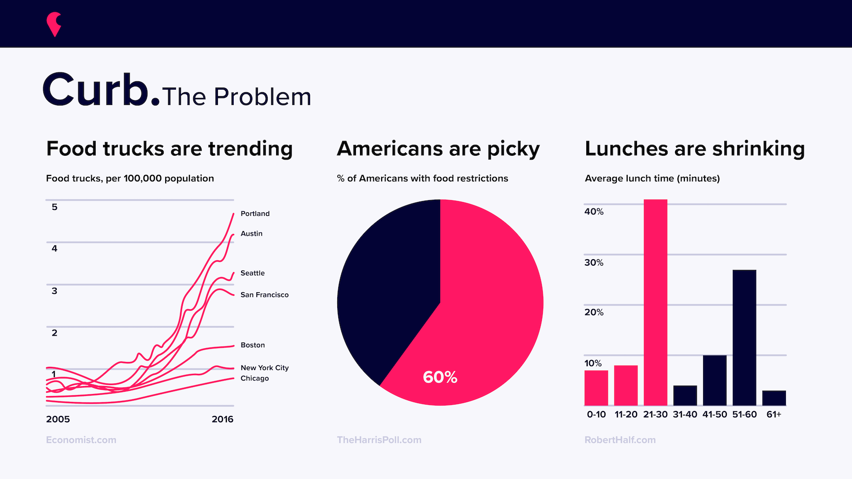
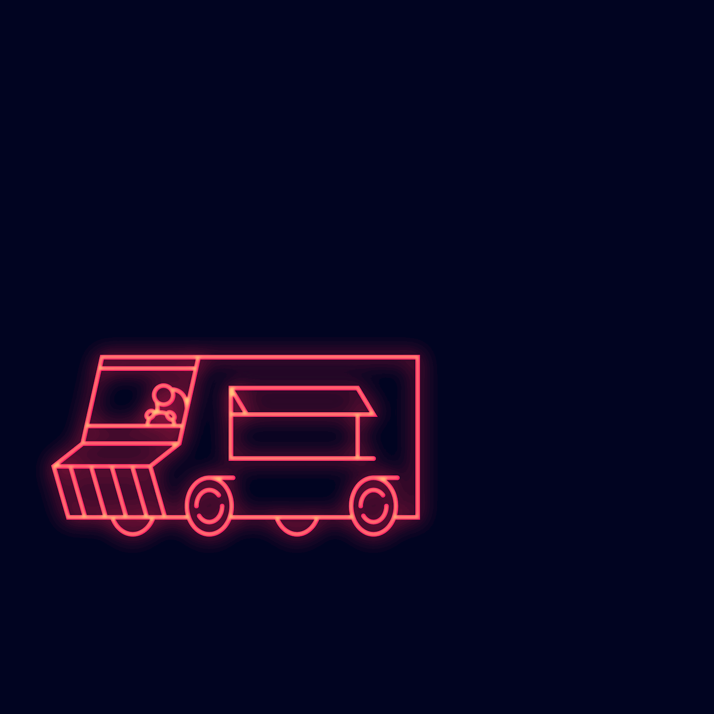
Before getting to work on the project we did research into the existing food truck ecosystem. I made us a small infographic to visualize some of the statistics we found that led us to believe the app would be useful, and I did an audit of other food truck-relevant applications, both for functionality and branding.

We found that nearly all of the apps in the space were unusable, and the rare one that was able to meet its core functionality was still not user friendly.

Branding

After our initial research I began establishing our core brand elements: a logo, icon, color, and typeface. The industry standard for a food truck app's design was definitely not great, and I knew I wanted our brand to stand out and scream confident and capable. I tried to tap into the exciting and young feeling of the growing food truck market, and breath fresh air into a space that seemed repetitive and dated. Food trucks are so cool, an app representing them should match.

I made us a logo that's a little clever, very memorable, and just edgy enough. I also set all of our copy in Proxima Nova, which works well in large-scale displays and in-app. It was also free for us. : )

User Interface

I designed our UI. Like 5 times, until I got it right. I also made our icon set, and the color treatment we do on each truck's profile picture. Functionality was a group decision that we edited as user research came in.

Clockwise from top left:
Version 1:  Initially we planned to do an iOS app, but user research pushed us towards web instead.
Version 3: My first pass at a web-based approach with more prominent branding.
Version 5: Final high fidelity prototype, handed off for development.

Development

I didn't do much for dev, but I did learn a bit of React so I could make a few components. I ended up making our buttons and filter icons using SVGs, as well as inactive variants for each. Shoutout to Framer for making React so accessible.

Promotion

We made a promo video. No one on our team was well-versed in video, so we made it a little lo-fi and pretty straight-forward, which felt very on-brand. Curb is about feeding people, so we filmed my friend Matt eating a burrito, and slapped one of my favorite songs on in the background. Threw that in the Premiere Pro toaster-oven and it came out nice and crispy.

Launch

I made us another video using spare footage from our promo. This time I felt a bit more confident getting creative.

Thoughts

At the end of the day Curb did go live on a temporary domain. We had a bunch of trucks ready to sign up and plug us, but we cancelled the project a month ahead of launch. It felt wrong to have so many businesses investing in our platform when we weren't sure what the future of it looked like after our graduation.

For now we're putting Curb in the fridge while we figure out our futures, but I'm immensely proud of what my team and I were able to accomplish over the year. We also got a lot of free mac and cheese. So worth it.