GIST

Word of Mouth, Online

A year ago I was contacted by a startup based out of San Francisco to take a crack at a logo design. Since then I've designed their pitch deck, aspects of the UI, marketing materials, and more. I even joined them last summer full-time for an internship.

A year later and I've improved so much. I'm currently rebuilding GIST's brand from the ground up because I can do it better than I could before. I'm going to start with the old stuff so you can see where I was a year ago, but please keep scrolling to see the new direction I'm taking.

GIST is an e-commerce startup that intends to bring the word-of-mouth online. We automatically verify your online and offline purchases and create rendered product images you can choose to upload to our platform. Next time you're looking for a new pair of sunglasses you don't have to search through thousands of Amazon results, but can simply see what your friends recommend.

Explorations

I had already redone our investment deck and began working on our teaser site when I really started to look into GIST’s larger visual identity. I put together a couple mockups and ended up taking a lot of queues from the fairly standard Dribbble direction at the time.

One of my big mistakes at the time was that I didn't consider how the visuals would relate back to our core theme and audience enough, instead focusing mostly on what I thought looked nice, seemed to fit alright, and could have varied applications.

Refinement

Eventually we found a palette that we liked and started building around that. I made our app icon, app store graphics, and made a few tweaks to our UI and created empty states. I also redid our investor deck and made a one pager, but I can't show those because of NDA. They're very ok though.

Brand Guidelines

I put together our guidelines, including details about our logo, typography, and even the algorithm we use to generate the colors in our product images.

One Year Later

Rationale

A year later I took a stab at redoing some of the old work I had done. I've improved a lot since the summer of 2018, and find it easier to approach projects on a larger scale, so I marked down some problems with the work I had done, and started working on fixing them.

1. Unfocused
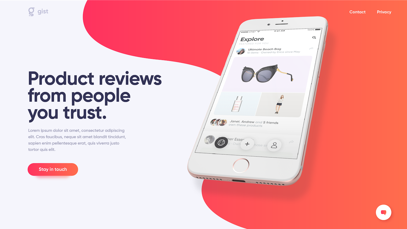
GIST does a lot, so we have a tendency to say a lot, but it comes across as vague and hard to digest. It would be better if we can refine our messaging to a singular simple idea that can guide the whole brand.

2. Uninspiring
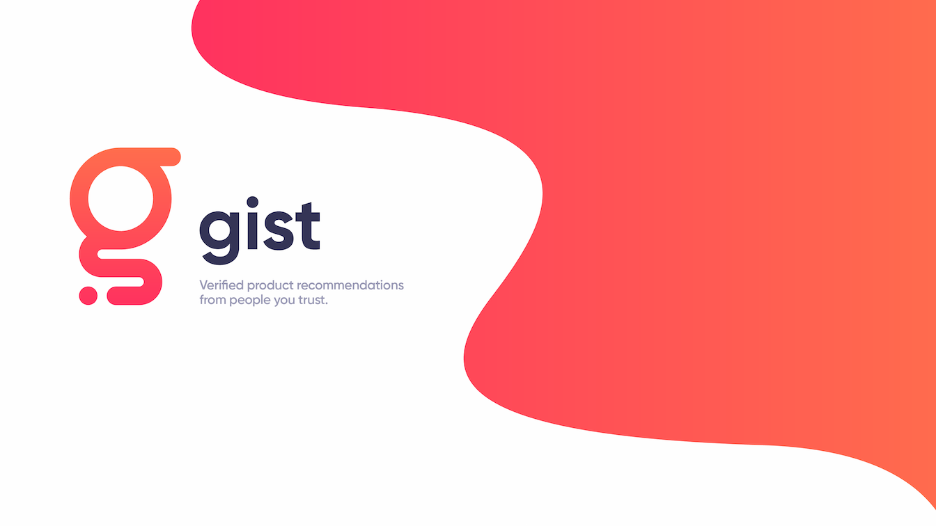
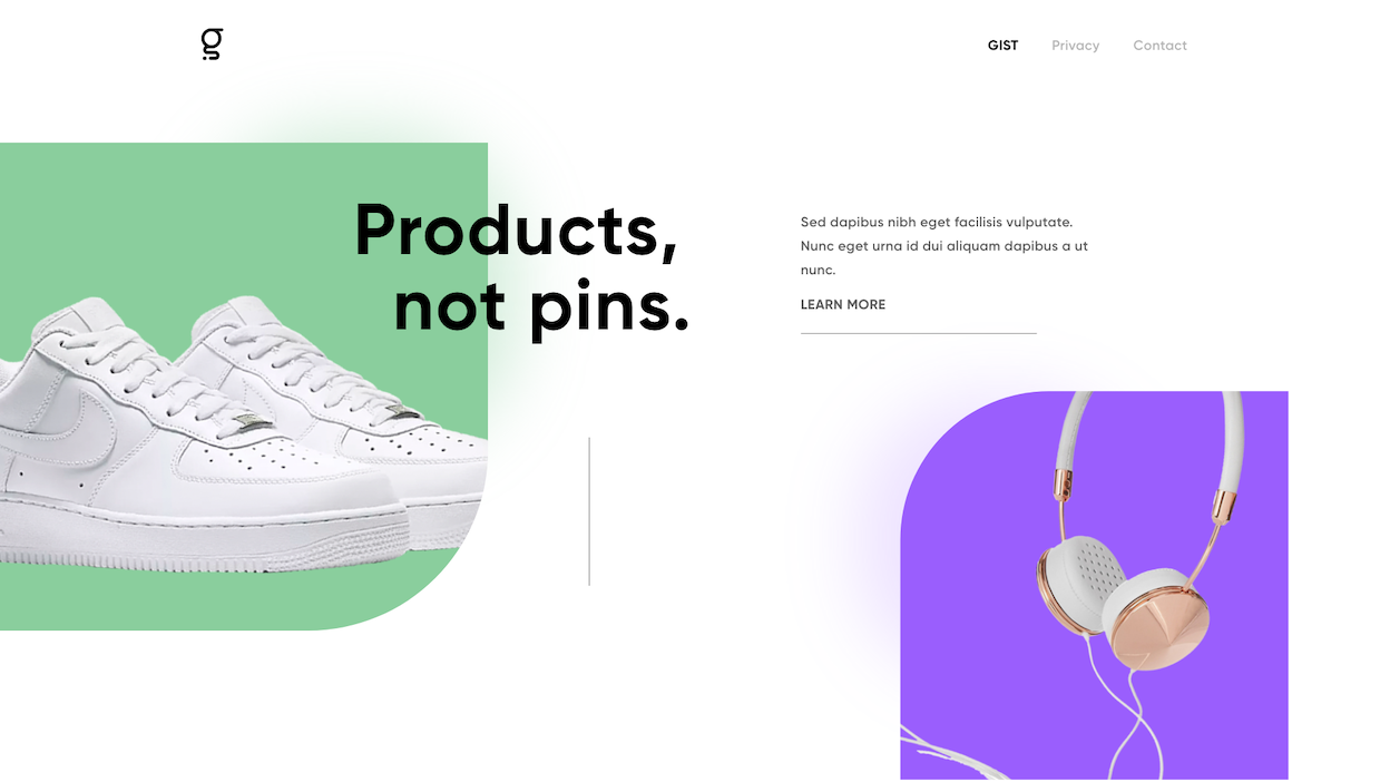
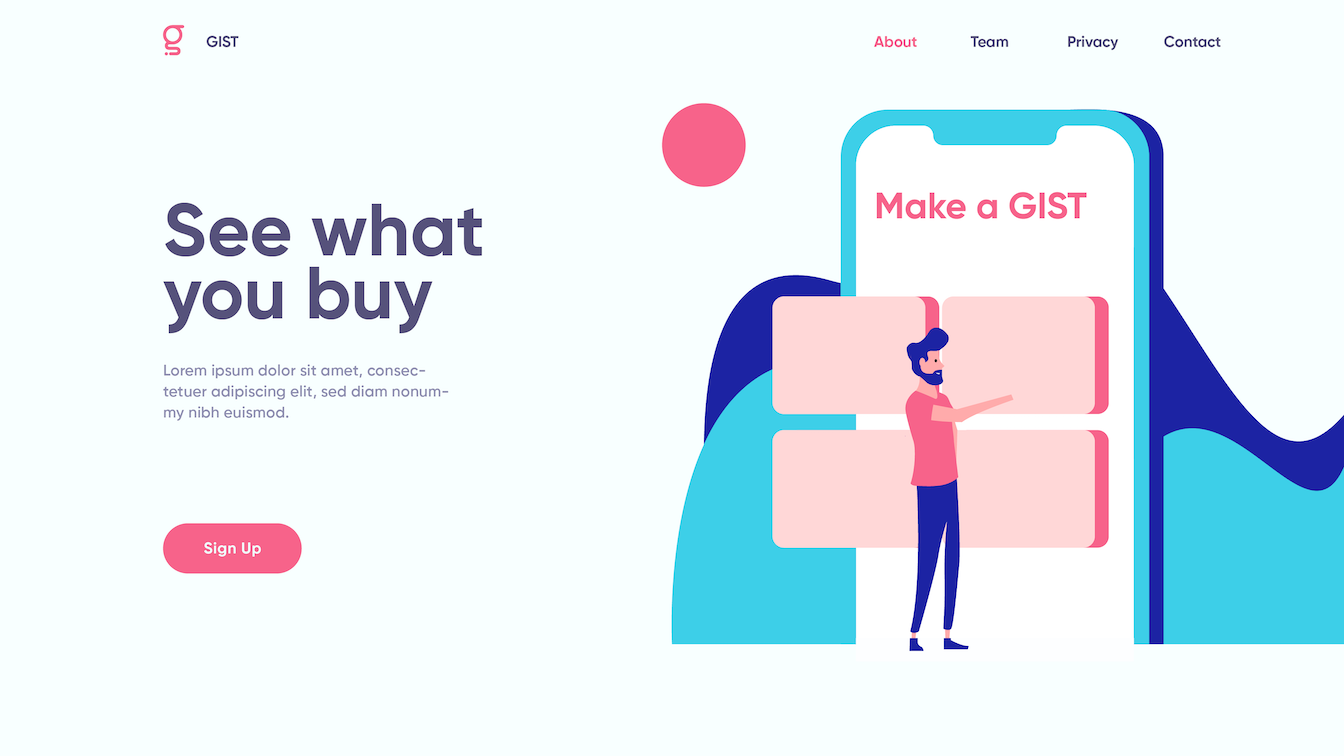
Our imagery is solid in its consistency, but ultimately fails to stick out from general trends in tech design.

3. Unaligned
GIST's imagery doesn't align well with our core audience. Younger Millennials and Gen Z appreciate bolder design more, and trends point towards continued adaptation of post-modern and retro-influenced aesthetics.

Messaging

I focused the core of GIST's brand down to simply "authentic." GIST's differentiating factor is that we are able to actually verify purchases. Products aren't advertised to you, or supplied to influencers who then give fake recommendations, but are instead truly what your friends use.

Tone

Along with the idea of authenticity is how we convey that in our messaging. To do so, GIST is unapologetically direct. We don't cover anything up, and try to talk as straight up as possible.

Brace yourself for rough prototype animations below.

Typography

I didn't really have a say in the typefaces chosen when I first joined the team, but for the redesign I've pulled our type further from the generic-tech-startup standard to something more distinct. I've taken some cues from the fashion industry as well since their aesthetic is more in line with our audience.

Color

I'm cutting the accent color. Our strongest branding element is the product image with a pastel background, so we can reflect that by using whatever color we want as long as it's within our color space. The other brand assets are distinct enough within our market that a specific color isn't necessary.

Thoughts

I'm still working through a bunch of different things for GIST as I continue fixing some of the mistakes I made last year. It's interesting to look back through this project and see how not only my branding skills, but also my entire approach has changed in just a year. When I first started working for GIST I would try to make as much content as possible and hope that something stuck. I didn't give much thought to the actual methodology behind my choices, but made decisions mostly on instinct.


Today I find myself working through my projects with a lot more intent. I want to push the boundaries of what branding can be, and to do so requires more than just keeping up to date with Dribbble trends, but actively thinking about how people perceive and interact with the brand's image. Concept first, design second.