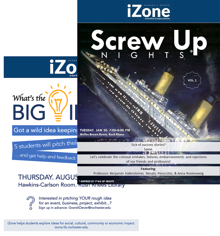
iZone

A New Space for Student Innovation

Students at the University of Rochester are getting bolder and more innovative each year. iZone is the University's new hub for creative problem solving, collaboration, and entrepreneurship.

I worked at iZone part time during my Senior year at the U of R. I was brought on to revamp their visual identity in order to more clearly promote iZone's mission and events to the University community. By the end of my first semester there I had established a set of guidelines and direction that felt far more in line with the energy the team was trying to give off and more relatable to the typical student on campus.

And because we're all thinking it, yes, iZone is a terrible name. Some donor chose it. We hate it too.

Before

Before I came into iZone marketing materials were created by whoever had the time. They used the University's prescribed navy blue and struggled to stick to a font family, but always using a sans serif. Materials were very text heavy and read like a narrative, relying on the viewer to read the entire poster to understand the message. They occasionally utilized imagery, always sourcing from Google Images.

A huge challenge I had to deal with was figuring out a branding approach without touching the logo made for us by the school, or relying on the name "iZone". Our team didn't like either, but we didn't really have a say in them, so I chose to just avoid them altogether.

Typography

Early on I picked out the IBM Plex family. It's huge, so I narrowed it down to bold, regular, extra light, and text weights of the serif, sans, and mono fonts. iZone has a huge variety of events and use-cases, so it was important that our type could vary alongside it while remaining consistent. Typically we used the serif for headers, sans for body, and mono for details / meta-data.

Color

Color was an easy pick for me, and a tough sell for my team. It was hard to break away from the navy blue that they had been using for six months already, but the color felt far too stale and safe for the welcoming and energetic atmosphere we wanted to convey.

Yellow is a happy and welcoming color. It is also reminiscent of one of iZone's favorite tools, the sticky note. At any given time our space is covered in sticky notes, each with a different idea. Some are grounded and serious, others are more far out, but each one represents a different thought by a student trying to make a difference. We try to hold onto that spirit in our visuals.

Yellow's also one of our University's colors, and while we use it in a very different way than them, it is nice to pay homage.

On the yellow we mostly use black to emulate the feel of a sharpie, as well as occasionally cyan or magenta for emphasis.

Doodle

Using doodles in our design was the real ground-breaking moment for me. Initially I spent a lot of time trying to make higher fidelity illustrations, but I worked part-time and was just one person (and still am!). It definitely wasn't sustainable.

Doodling has always been part of iZone's core process, so using them in our marketing and communications felt cohesive and allowed me to produce materials much quicker.

We used doodles to show off our events, for random social media content relevant to what was current with the University (I drew a funny looking fox when a local fox gained fame and ran for student president), and sometimes just fun random gifs.

Portraits

The last thing I did at iZone was a portrait series of everyone on our team. I took heavy inspiration from Ueno for these (thank you!), and had to give it a shot myself.

Later on I put them in a profile card that we put up in our space so students felt more comfortable interacting with us and better understood what we did behind the scenes.

Editing by me, photos taken by my coworker Maggie Peng. Props a team effort.

Thoughts

I'm really proud of what I was able to do at iZone, and hopeful that the guidelines I set persist past my graduation. It was a lot of fun being able to take the theme of innovation and entrepreneurship in a vastly different direction from the standard pseudo-tech aesthetic. I tried to put a lot more heart into the design of iZone, and I think it paid off in standing out from the rest of the University's institutions.