Rochester Design

The U of R's first undergraduate design council

In my Junior year I founded the first design club at the University of Rochester, and presided over it for its first year and a half.

The U of R doesn't have a dedicated design program, but it does have a lot of really talented students spread across majors all interested in the field to varying degrees. We made RD to be the hub for these students and a collective voice for our interests to the administration.

After my graduation I did a rebrand of RD; I always wanted to position the club my own way, but let other members take the lead when we were getting started. Now that I had some distance from the club, it seemed like a good time to implement the ideas I thought of before, but didn't have the time to execute.

Messagng

RD was made for the outsiders, for those who pursued a study that their institution didn’t really care about. For the self-starters, who had to pave their own way because one wasn’t given to them. And it was for those who show more than they tell, because doing something is more important than just talking about it.

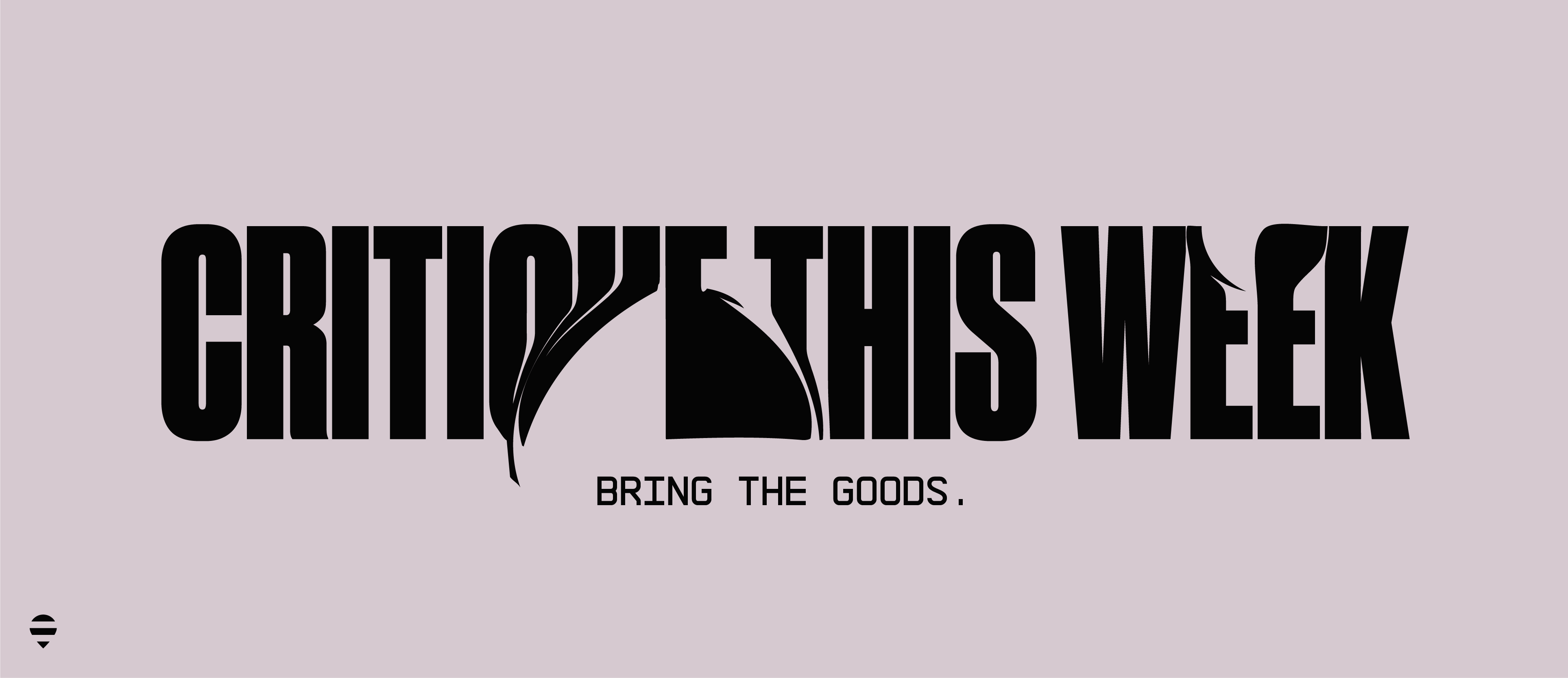
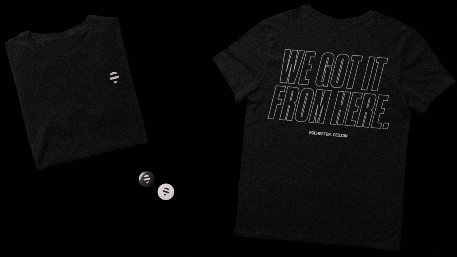
I distilled the spirit of RD into a single message; “We Got It From Here.”

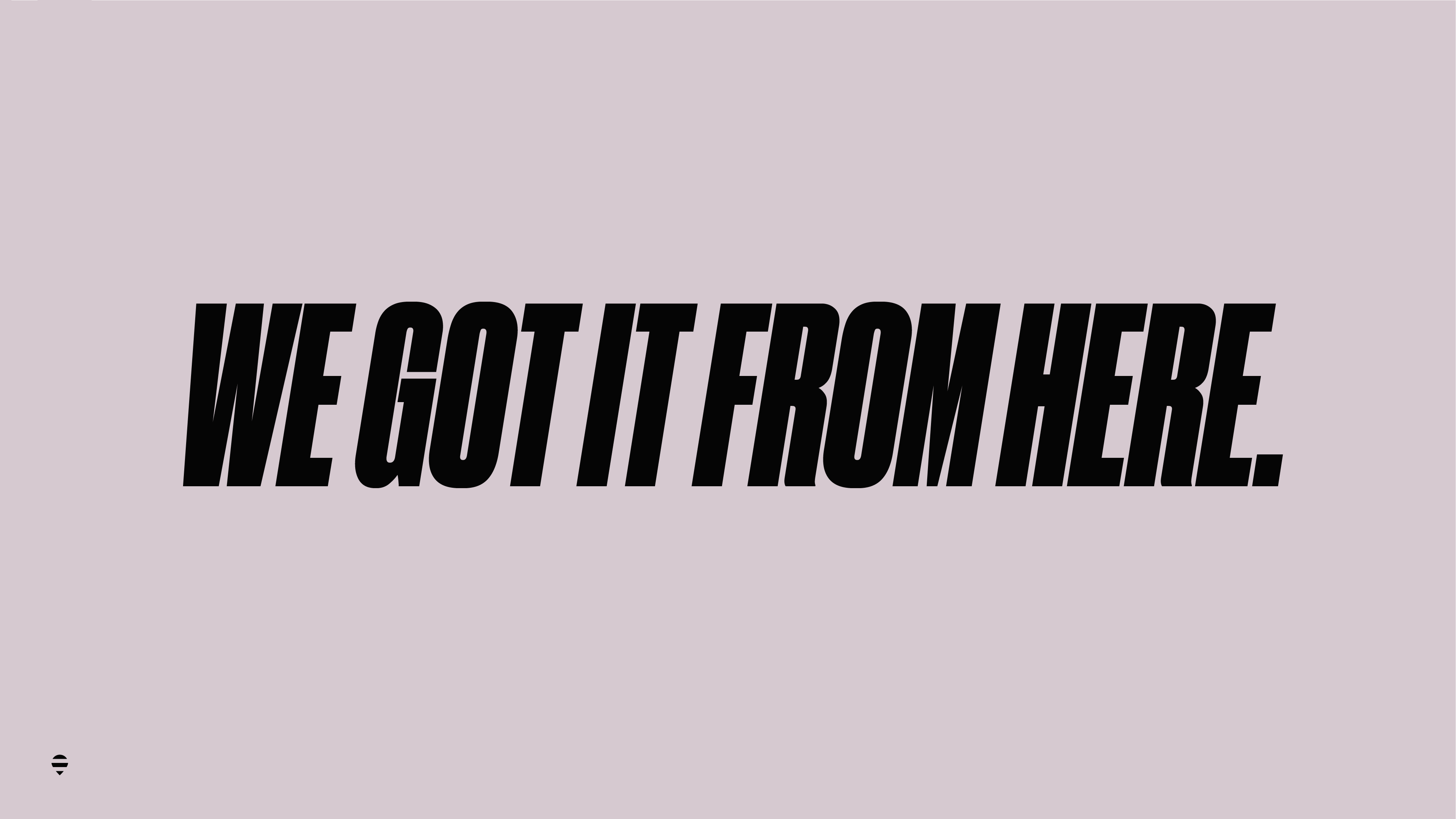
It’s a declaration that we’re taking the lead, a signal for the can-do attitude and bold, relentless ambition of our members while maintaining our laid-back, casual, and matter-of-fact demeanor. It’s also a reference to my all time favorite album, “We got it from Here… Thank You 4 Your service “ by A Tribe Called Quest.

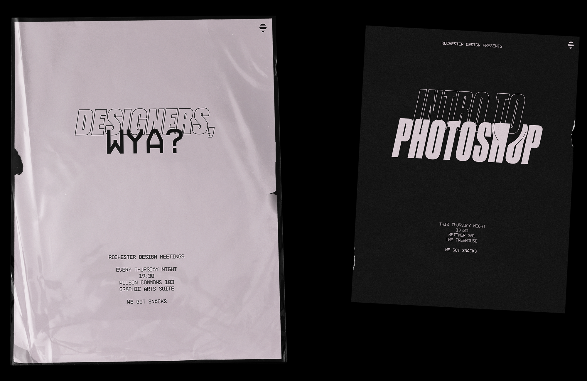
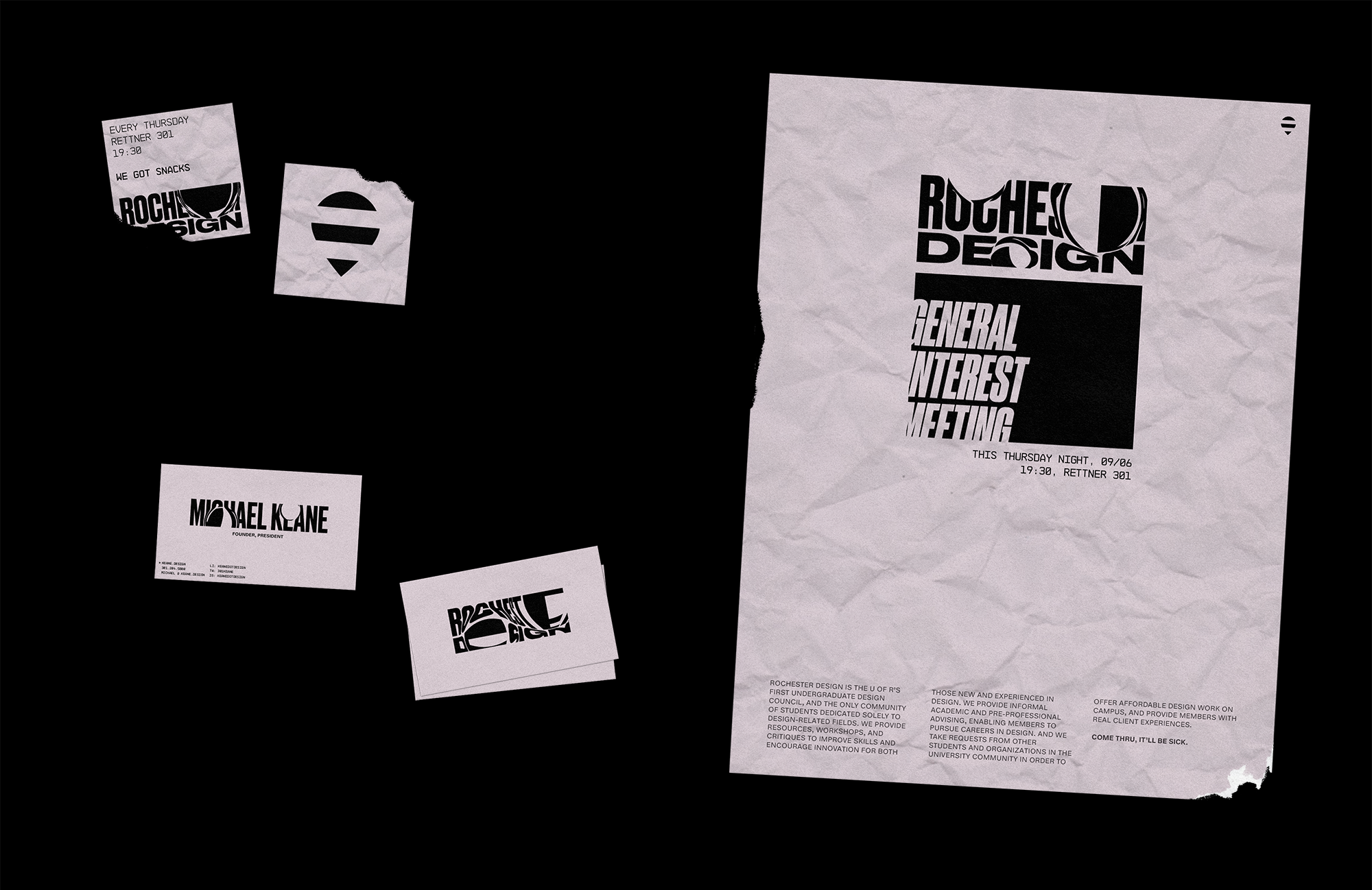
I based the rest of the messaging around these ideas as well. We’re always casual, always say what we mean, and can be a little tongue-in-cheek at times.

Type & Color

I was ambitious with our type. I put most of our headers in Druk, usually super, condensed, and italicized. It feels very loud and direct, which I think is important for most brands these days. I also threw in a little Architekt Bold. I love Monospaces, and I think they work really well to allude to both digital and print materials. It also creates a really strong contrast with Druk when put together.

For small amounts of copy I just stuck with Architekt, but for larger paragraphs we use Helvetica Now, a recently refined version of the tried and true.

I put almost everything in a washed out pink and black. No one on our campus is going to get even remotely close to that color, it’s just too out there, so we can easily own it.

Usage

With the core brand elements all detailed out I started mocking up the important assets for the club. Posters, our email template, and some merchandise.

Our weekly email is our most important formsof communication. Other clubs like to use Facebook or group chats, but we always had an unusually active email chain going. It was definitely less practical, but always fun, so I put in some extra effort to make sure it fell in line with the brand and had quality content.